
**UPDATE 5-10-2015**
It appears that this business is now closed. Trada was shut down by their creditors. Perhaps it’s safe now to link to my true feelings from 2012 about how this is the worst logo of all time. Perhaps some of the $19 Million they raised should have been spent on a new logo. That would not have made much of a difference on their bottom line, but having the worst logo of all time might be a signal that other things aren’t doing so well either.
If you are a business owner, you may have found yourself driving around town looking at signs of other businesses – and judging them, studying them, and understanding what makes a good sign vs. one that sucks. It’s amazing how terrible some signs can be. Really, what were they thinking??
Elements of a good signpost:
1. Can people read your sign? Is it understandable? Pronounceable? Clear? Legible?
2. Does your sign convey what your company does? What service it provides? Is it a mystery?
3. Does your sign look great? Is it attractive? Appealing? Catchy? Noticeable? Special? Cool?
4. Will your sign stick in my head when I need the product or service you are offering?
Let’s look at a few signs:
1. McGuckins Hardware in Boulder has some awful signage. Yes, it’s true everyone LOVES McGuckins and we all know what it is and where it is and that they sell everything awesome. But take a look at their signposts:
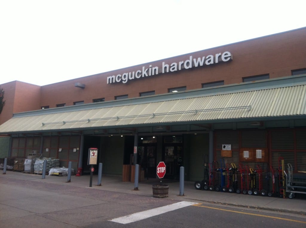
This sign above the North entrance is not sexy – but it’s clear. I know what’s going on here.
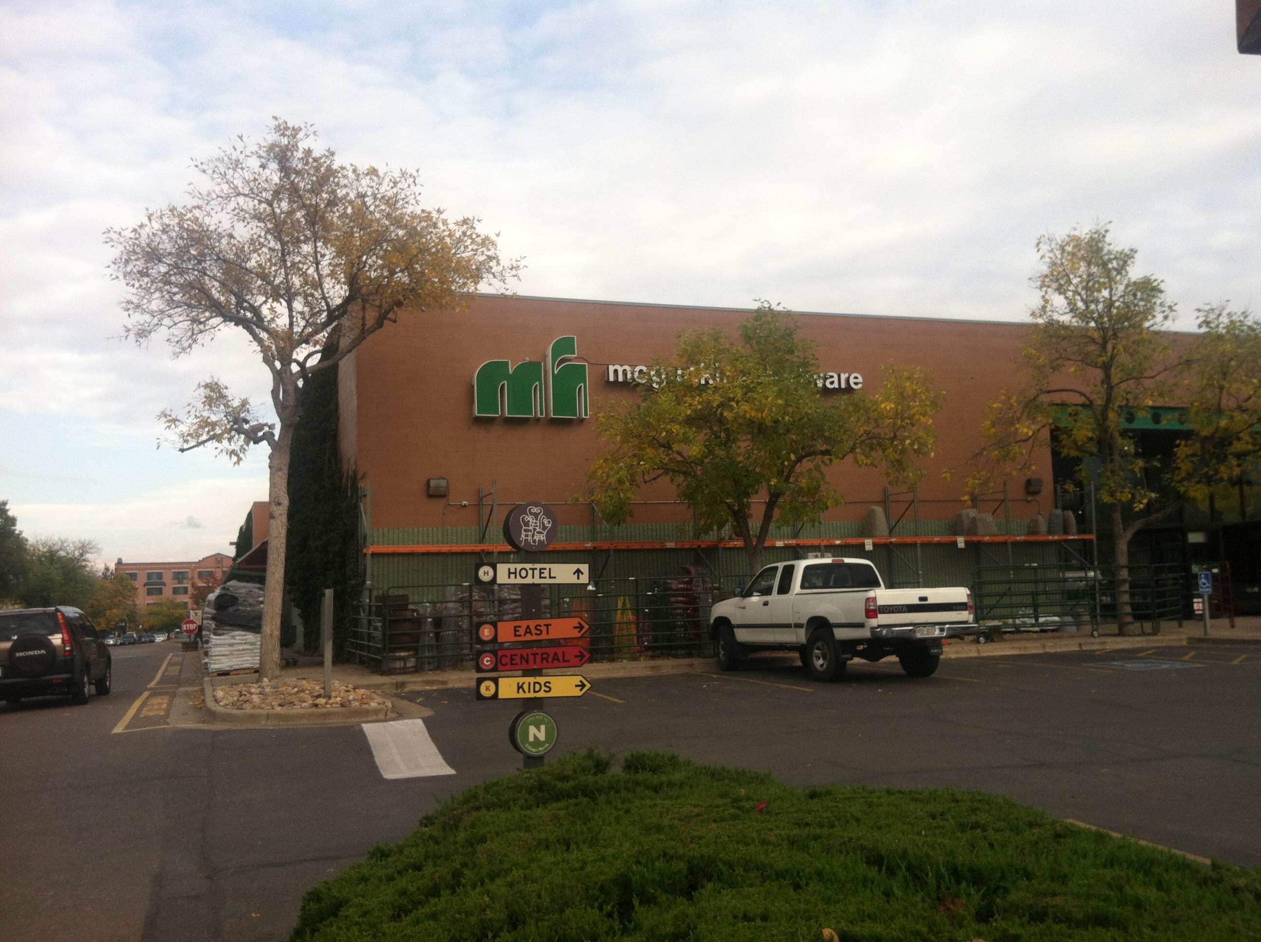 What is this above the West entrance? Is that a Logo? A fancy “M h”? Is this clear? The rest of the sign is behind a tree. I’m not really sure why this unmemorable logo is on that brick wall. It communicates nothing.
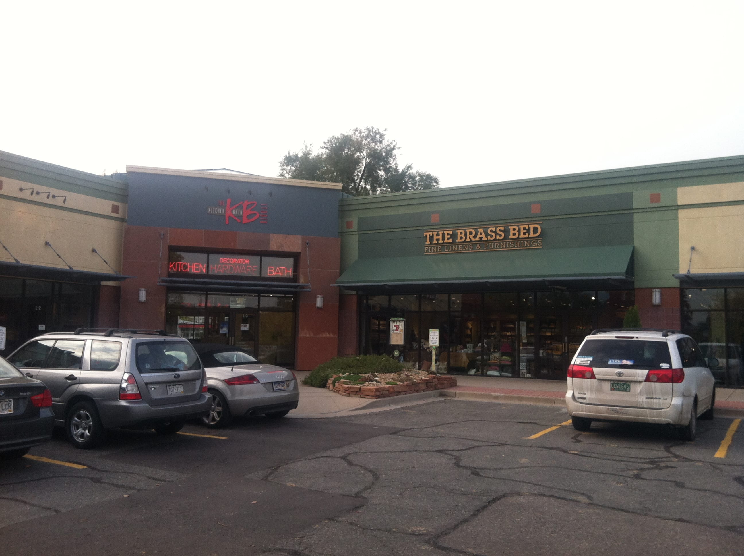
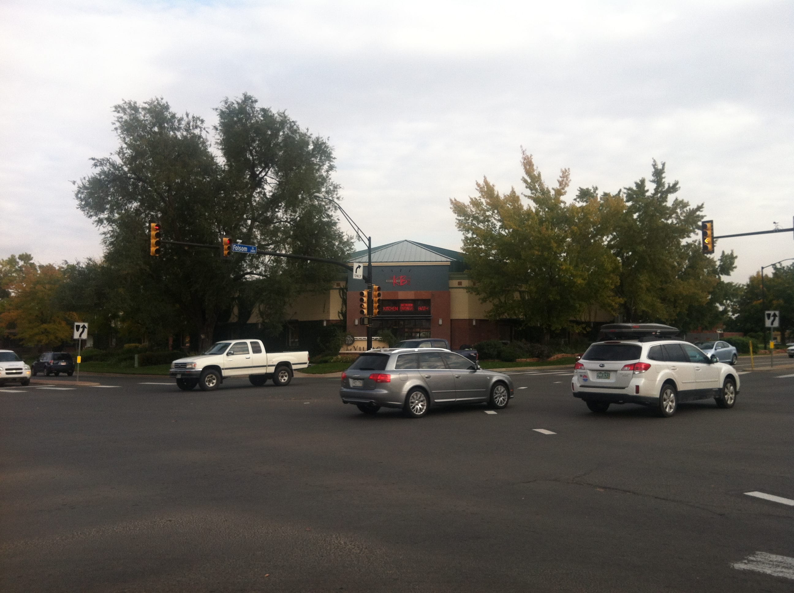 There is an awesome Kitchen & Bath Design Center in the corner of the North parking lot. Lot’s of people love this place, but can you tell what this is in the picture from the middle of the intersection of Folsom & Canyon? Thousands of cars pass this intersection every day. It’s an amazing location for a sign. But I can’t read this sign.
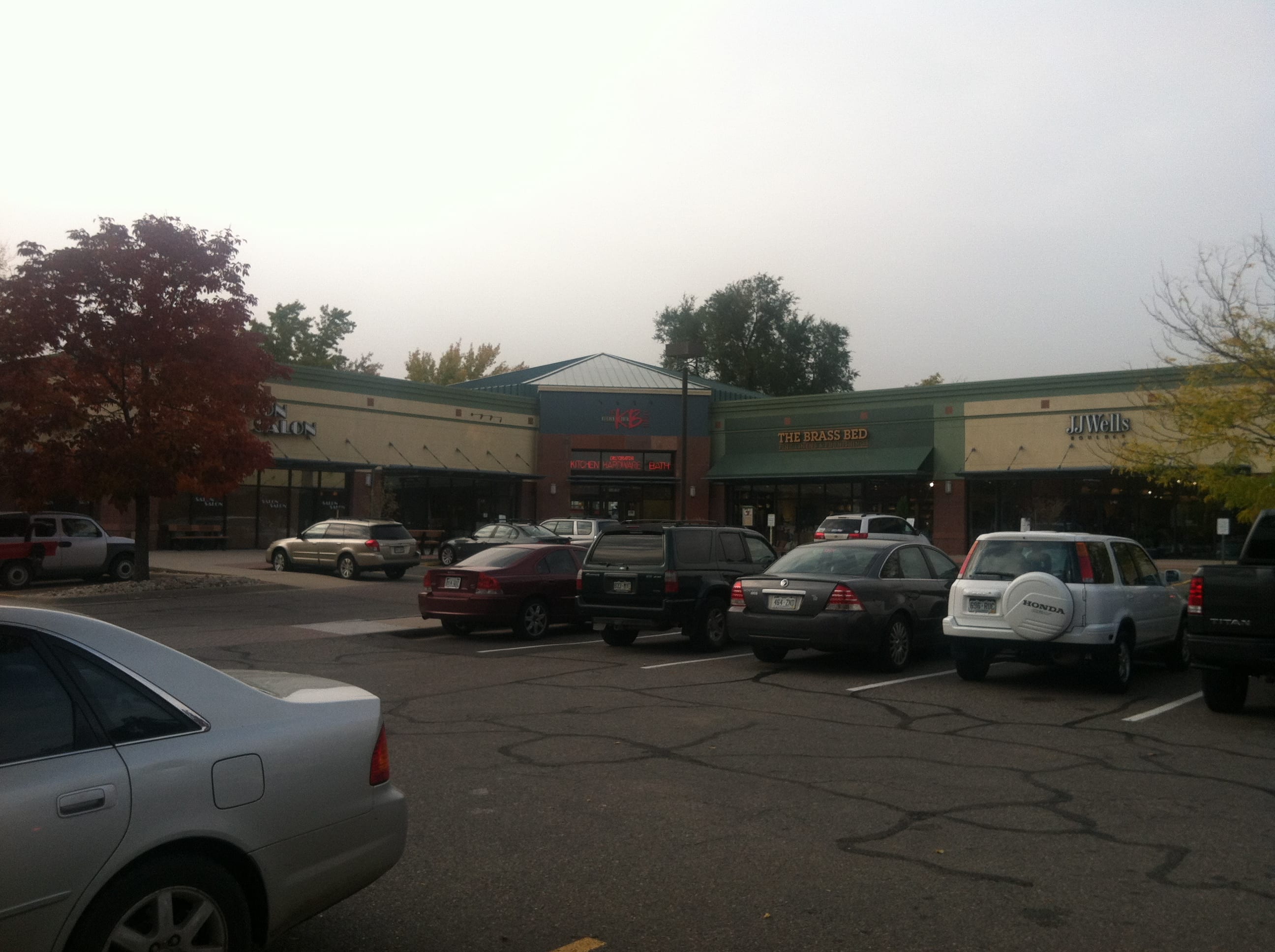 Same business from the other side of the building, from the parking lot? Is there any clue what’s going on there?
 How about from a little Closer?
 How about now? Do you know what this business does? Something to do with Kitchen & Bath it looks like. But people, this is right in front of the store and I still can’t read it! The “logo” is a fancy, expensive yet unreadable blur. What is the big pink K B all about? Is that the name of the store? I can understand why they needed the neon signs underneath their other sign – at least they are readable! Look at all that lovely opportunity to place a powerful, compelling, memorable sign at the top of the building. This business is really missing out on tons of pedestrian and car traffic. Can your business afford to miss out like this?
Let’s pick on another awesome company with some signpost improvements to make: Slade Glass
I happen to love Slade Glass and have used them and their reputation is fantastic. It’s a great glass company. Yes, they have been a client of Trumpet Local Media [disclaimer] but that’s not why they are mentioned here. I’m bringing them up because one day I walked past one of their lousy signposts – their truck.
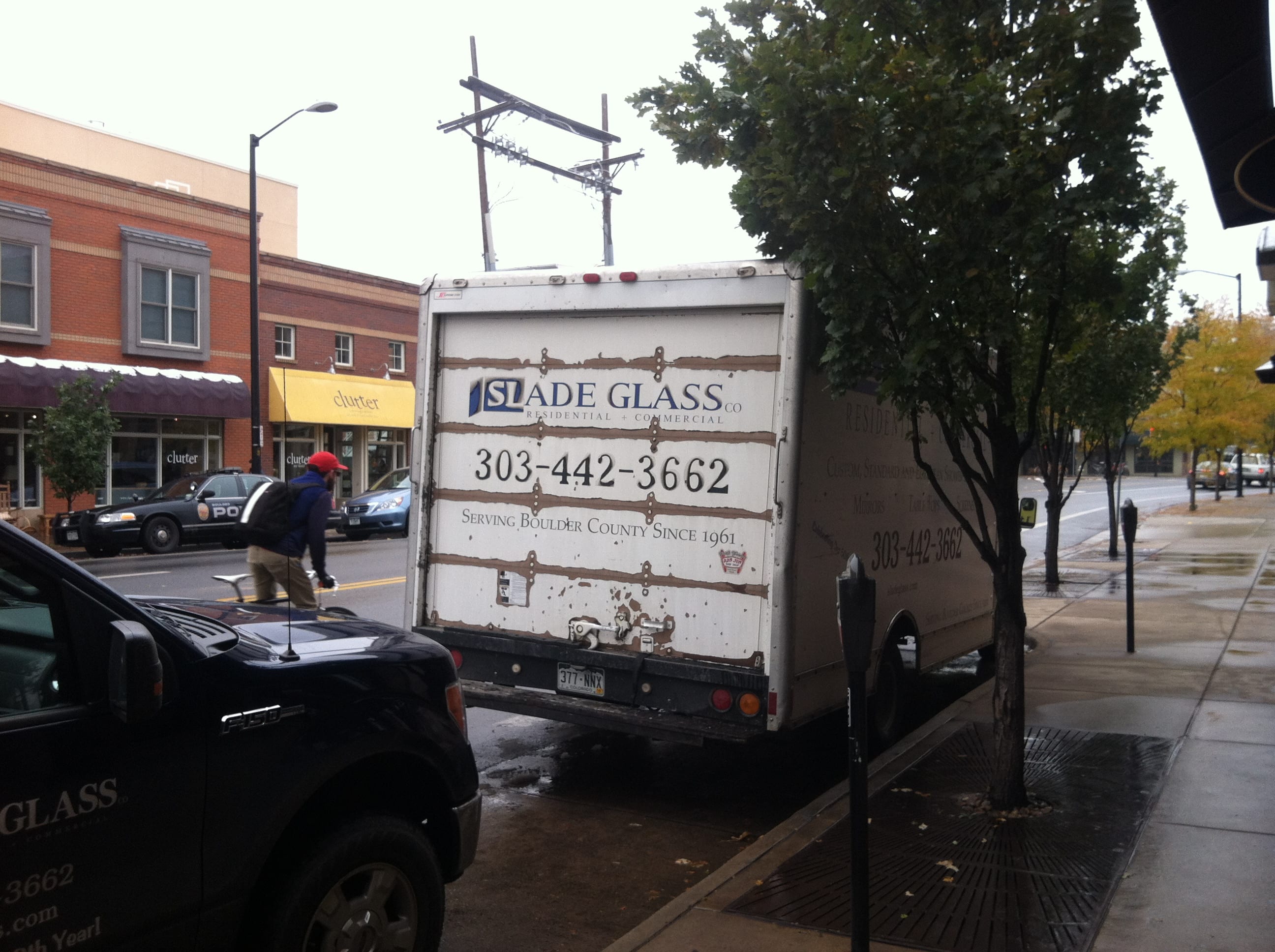 What does this truck convey about their business? Do they have impeccable craftsmanship? Attention to detail? I happen to know that they do. But that’s not what other people are thinking. This truck needs a paint job. It portrays laziness and a lack of caring and no one wants that from a glass company. Please re-paint your truck!! Thousands of people are getting impressions of your business from your tuck – are they good impressions?
How are your signposts? Are they doing all they can do to bring in new customers off the street? Do they need a new paint job?
We spend a lot of time helping businesses with their online signposts. Often it’s still the brick-and-mortar signs that are still most important after all.
Do you think I’m really opinionated about this topic? Yes, well, I AM! Your sign post should be awesome. It should not suck. Lets move on to another incredible example. I’d introduce the name of this company on East Pearl Street in Boulder, however, even though I walked right past it…..
I Have No Idea What This Is:
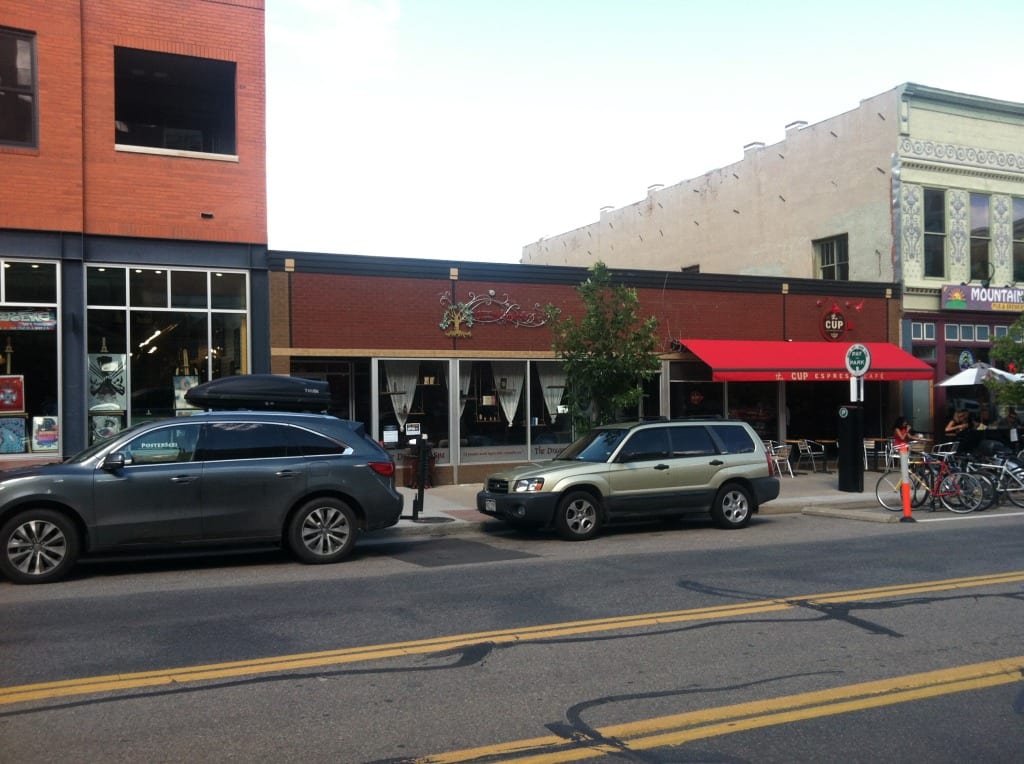
Looks like a super fancy sign. Must have been expensive. Does it light up at night? I sure can’t read it in the middle of the day from across the street. Wait, let’s get a little closer.

I still can’t read that sign. Down in the window it say’s “The Dragontree Spa”. And is there something intentionally placed in front of the name of this business? Let’s get closer.
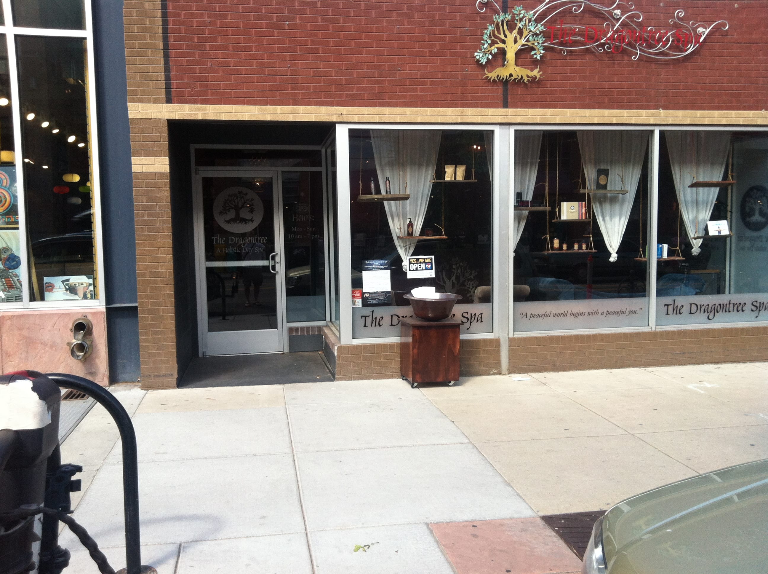
For Reals. I’m THIS CLOSE to this business and I cannot read that expensive fancy sign. Ugh. This is painful.
Let’s move on to another business. It’s actually a sizable business here in the Heart of Boulder – in the Daily Camera Building [which has since been demolished].
This sign is very visible and readable. But that’s not really a benefit in this case because its such a crappy sign! In fact, I honestly believe this company logo is “The Worst Logo of All Time“. Let’s take a look:
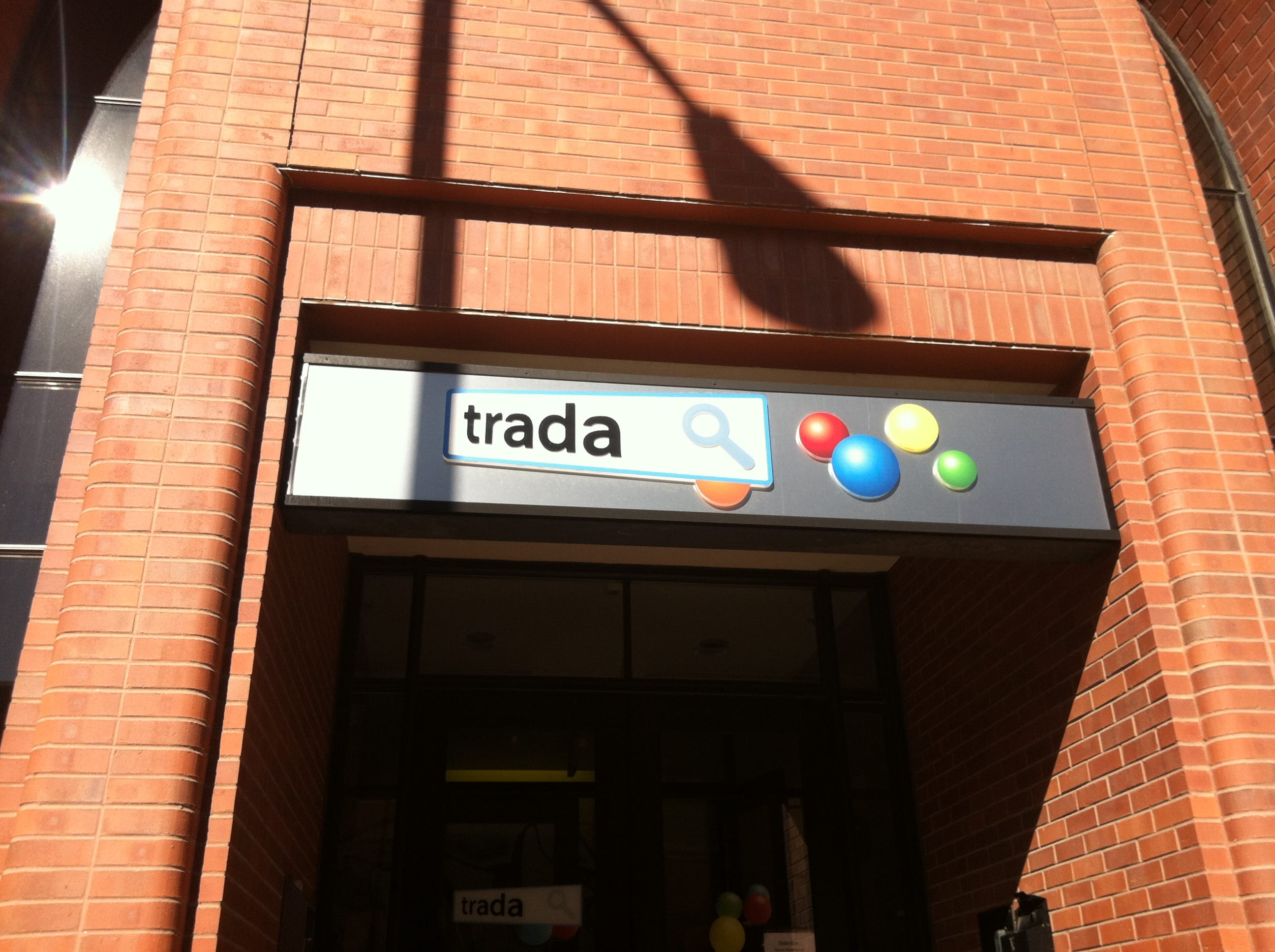
This is/was the front door of the business – off Walnut Street. At first glance perhaps this doesn’t look so bad. But there’s no quantity of primary color orbs that can disguise this completely lame company logo. Are those uncreative letters growing? As in getting magnified? Is that a magnifying glass? What is that? Why is that? I happen to know that this company offers services related to Google Adwords. Aha! Now you get it, right? Google “Search”. See the orbs are the same color as the Google Logo, right? You knew that, right? And “Search” has something to do with – oh. A magnifying glass? Wait, really? What? It’s like a nerdy little inside joke for the trade – gone very bad.
Let’s see the sign on the front door itself. Well, this version is a little different, but we can see very clearly how much money they spent here on Graphic Design. Is it just me or is this terrible? 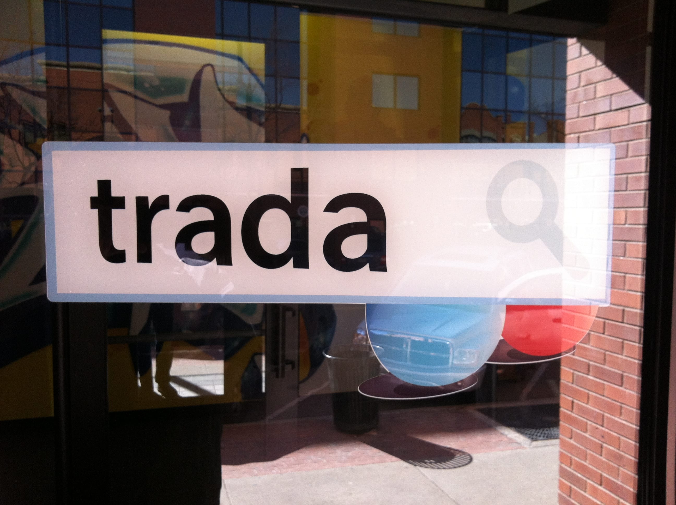
It’s not like they are shy about this logo. It’s very large facing Pearl Street. In fact, I’d say it was one of the most visible signs in town.
I’m not a graphic designer, and if it were up to me to create a logo myself – it wouldn’t be phenomenal. But that’s why I’d hire a professional to do it – or select from a bunch of affordable potential designers at 99Designs or somewhere. And I’d ask other peoples honest opinions that I trust. Having a great signpost says a lot about your company. It’s worth the effort to make sure it doesn’t suck.
